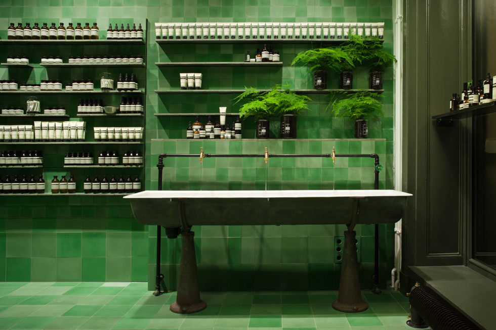
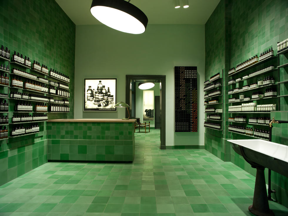
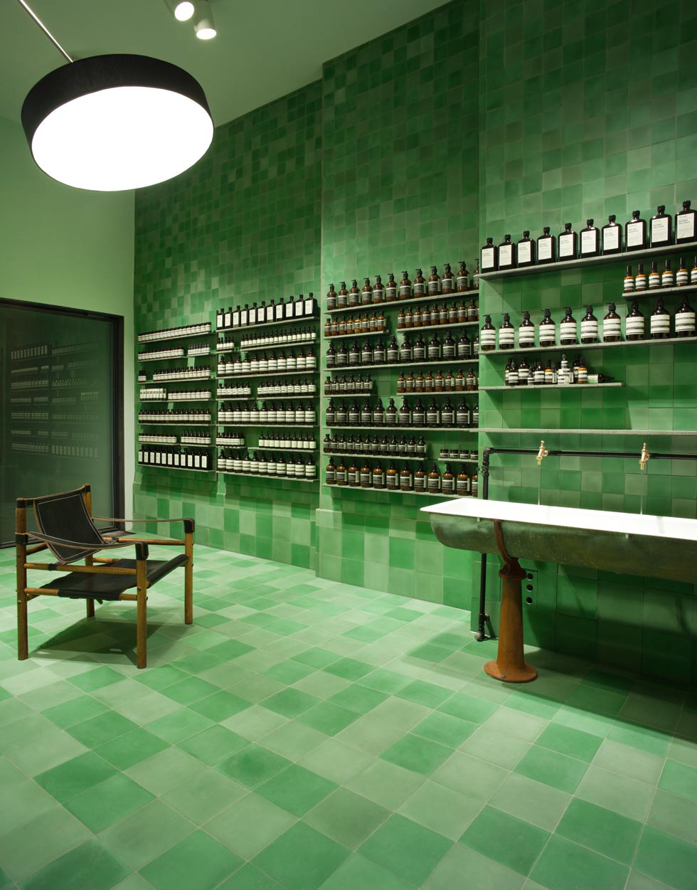
I’m quite taken with the design of the Aesop Signatur-Store, Berlin spotted in Architectural Digest – German Edition. The green scape of tiles used make a stunning abstract backdrop to the simple dark bottles of the Australian skincare brand.
Each Aesop store interior from Melbourne, New York, Paris, Hong Kong and beyond are designed by architects around the world keeping each design different from the other…no two are the same. Dennis Paphitis, Aesop founder explains why in an exclusive interview in Dezeen “It wasn’t so hard to respectfully consider each space individually, consider the customer, the context and to bring a little joy into the conversation.”
In Taipei “we needed to work with a local Taiwanese architect on the first store there. And that just got me thinking about the kind of assault on the streetscape that retailers inflict through the ordinary course of mindless business, the idea that one size would so often be forced to fit all. It wasn’t so hard to respectfully consider each space individually, consider the customer, the context and to bring a little joy into the conversation….Architecturally our criteria is always to try and work with what is already there and to weave ourselves into the core and fabric of the street, rather than to impose what we were doing…
I’m personally more comfortable with under-designed looking design, if that makes sense, or design that dissolves and recedes rather than screams ‘look how clever I am’.” ~Dezeen
Please visit Dezeen for a look at other Aesop store designs from around the world and to read the whole interview.
~images via AD
